

You can combine these colours with most of your garment pieces and create new looks… here are some of my jumpsuits in some neutral tones
https://www.instagram.com/reel/CTkC5emjsSD/?utm_source=ig_web_copy_link
Do you know, What these colours signify?
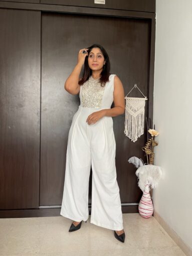 White-
White, an inherently positive color, is associated with purity, virginity, innocence, light, goodness, heaven, safety, brilliance, illumination, understanding, cleanliness, faith, beginnings, sterility, spirituality, possibility, humility, sincerity, protection, softness, and perfection.
- White is bright and can create a sense of space or add highlights. Designers often use the color white to make rooms seem larger and more spacious.
- White is also described as cold, bland, and sterile. Rooms painted completely white can seem spacious, but empty and unfriendly. Hospitals and hospital workers use white to create a sense of sterility.
- Some of the positive meanings that white can convey include cleanliness, freshness, and simplicity. The color white often seems like a blank slate, symbolizing a new beginning or a fresh start.
- On the negative side, white can seem stark, cold, and isolated. Consider how a large, white, empty room might seem boring, bland, and stark.
In Feng Shui
White is considered a powerful color in feng shui, a system of arranging your environment to create harmony. Colors are linked to certain feng shui elements and in the case of white, the element it expresses is metal.
 Black-
Black is a popular color in retail. In color psychology, black’s color meaning is symbolic of mystery, power, elegance, and sophistication. In contrast, the color meaning can also evoke emotions such as sadness and anger.
Positive Associations
We think of black as sophisticated and serious. It’s the preferred color for much formal attire, and the little black dress is a classic piece of attire that’s timeless and always appropriate. Black is unambiguous, definite. It’s not easily misunderstood, and in design it’s dramatic and helps create a feeling of certainty.
Negative Associations
Black’s sober hue is associated with mourning in much of the world. A black mark on your record reveals wrongdoing, and we characterize bed people as being black-hearted. Black is frightening, as it conceals, rather than illuminates, and the cover of night is a perfect scenario for bad behavior. Too much black in design can be overwhelming and dull.
In Feng Shui
Black is associated with the water element and evokes power, mystery, and calm.
When it’s used sparingly, black has a grounding effect on your environment.
 Cream-
Cream gets its name from the dairy product naturally produced by grazing cows. To make the pale yellow hue, white is mixed with a tad of yellow. In art, cream is often used as a base for skin tones. A quiet and pleasant hue, cream is neutral, calm and relaxing
Like other neutral colors, cream is extremely versatile–combine it with other neutrals for a sophisticated, elegant and conservative feel, add in bright reds, greens, or yellows for a more provocative and eye-catching palette, or use it alongside lavender, and rose pink for a feminine touch.
Cream is dependable, conservative, and flexible. The color beige is neutral, calm, and relaxing. The attributes and meanings associated with beige change based on the colors it accompanies.
The color cream offers some of the warmth of the color brown and the some of the crisp and coolness of the color white. While it is a relaxing color, beige is often seen as a dull and boring color.
A similar color to cream is ivory, a neutral, relaxing, and calming color, has some of the same pureness and softness of the color white, but with a warmer tone. Ivory represents quiet and pleasantness. The color ivory sets relaxed tone of understated elegance.
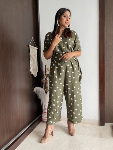 Olive-
Olive green is a dark green shade, but in fact, this shade belongs to a mysterious yellow family (while adding grey/black color in the yellow tone).Usually, the olive hue is considered as a conventional symbol of peace and harmony. Moreover, the color also signifies perception, empathy, space for the humankind.
The color gives good vibes as it has a better sense of identifying right and wrong. This soft shade also defines wealth and ambition.Olive green is a versatile color. It looks sophisticated alongside neutrals like beige, tan and maroon—a color palette famously used by rapper and designer Kanye West in his Yeezy clothing and shoe lines.
Olive green is popular in fashion as it is considered flattering to most skin tones. In interior design, a splash of olive green can warm up a room.
To highlight the hue, pair it with complementary reds and violets. For a natural look, combine it alongside navy and light grays.
Positive Associations
We associate green with vitality, fresh growth, and wealth. We generally think of it as a balanced, healthy, and youthful. We use green in design for spaces intended to foster creativity and productivity, and we associate green with progress.
Negative Associations
What’s fascinating is that as positive as most of our associations with olive green are, it carries particular potent negative connotations as well. Someone who feels sick might look “green around the gills,” and certain yellow-gray greens have a distinctly unpleasant, institutional feel to them. We link green with envy and with greed, Too much green can cause people to become placid, lazy, slow, moody, depressed, and lethargic. Too little green can cause feelings of apathy and fear of rejection.
In Feng Shui
Green is the feng shui color of renewal, fresh energy, and regeneration. When working with olive green, it is important to have at least several different shades in order to maximize the feng shui energy effects.


Itís difficult to find educated people about this subject, but you sound like you know what youíre talking about! Thanks